Home >
Doc >
Learn Relative Strength Point & Figure Charting > Extreme volatility - Shortest time period

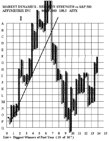
This stock exhibits “wild” volatility relative to the market. The period of time covered by
the chart is only six or eight months and the plot of relative strength goes off the scale at both the top and the bottom.
Performance relative to market
Better than market – Upward sloping graph

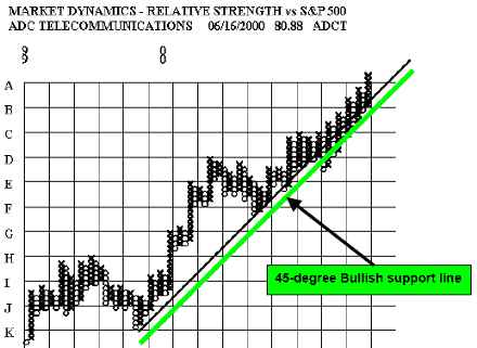
This is an example of a stock that completely outperformed the market from late ’99 to mid-2000. The 45-degree bullish support line is always started from a prominent low on the chart and is drawn upward to the right at a 45-degree angle.
Even with the market – flat chart

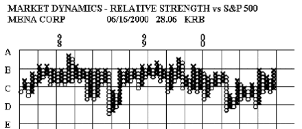
This is an example of a stock that has been flat relative to the market for almost the entire period from mid- ’97 to mid-2000.
By W. Clay Allen CFA
Next: Analysis of trends
Summary: Index