Need to revalue assets due to changing conditions – “Creative destruction”

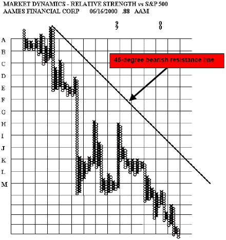
The process of change results in the need to revalue assets frequently. Schumpeter said that progress is the result of a process he called “creative destruction” The free market produces winners and losers. The data from the market helps portfolio managers to identify and avoid losers before it is too late. This process can be expected to continue into the future as long as markets exist.
The difficulty in interpreting current events - Current events are not history to
us – We don’t know what the consequences will be.

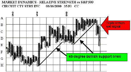
It is very easy- now that we know what happened – to say, “sure I would have sold that stock on that triple bottom sell signal” The problem is that when we see the signal we really can’t know whether it will follow through or not. We don’t know what the significance of the signal will be. In this instance the follow-through was immediate, dramatic and down. The stock market often demonstrates “non-linear” behavior in which small causes may produce unexpectedly large results. This is often true of sell signals.
In my opinion, every major sell signal that includes the penetration of a bullish support line should be treated as a danger signal with potentially serious consequences. I am referring to sell signals on current positions in the portfolio. In order to ensure the avoidance of major declines - all sell signals must be honored. It is only when the market is in a state of deep distress that sell signals can be ignored.
Charlie Ellis said years ago “ 80% of next years problems are in the portfolio now”. The relative strength in point and figure format is just the tool to help root out those problems before they hurt the portfolio’s performance. But to get the benefit - you must act on the signals!
The distribution of returns from stocks - Non-normal – peaked with fat tails. Proportion of the population in the extremes of the distribution is 5 to 10 times what it would be if normal - 80/20 rule holds in the stock market why?

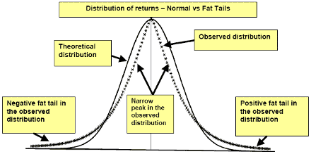
The distribution of returns from common stocks differs from the normal distribution in subtle but important ways. This is a stylized comparison of the two curves with the solid line depicting the academic normal distribution and the curve plotted with + signs representing the real, observed distribution of returns.
The real world is characterized by a distribution that displays a high degree of kurtosis (i.e. fat tails). A narrower peak around the mean also characterizes it. What this means in “real English” is that there are far more major winners and losers than you would experience if the real world distribution were exactly normal. Research has indicated that there are 5 to 10 times as many stocks in the extremes of the distribution than there should be. This indicates that major long-term trends tend to run longer and farther than we should normally expect.
These are also the most important trends that we should spend our time trying to find and
invest in. The narrow peak seems to indicate that most stocks tend to mirror the major market averages. These are also most likely to exhibit trading range characteristics. The conclusions seem to be clear: Use a trading range approach to tracking most stocks and use a trend following methodology when dealing with stocks that have demonstrated an ability to depart from the averages and to move out into the “fat” positive tail. This also suggests relative strength as an effective way to identify major trend stocks.
The difference between these two distributions has extremely important consequences for portfolio management in terms of methodology and a realistic application of portfolio management tools.
By W. Clay Allen CFA
Next: Theory of Runs
Summary: Index